Elephantastic markers
Hello again, and sorry for the long hiatus. It’s been nearly two and a half years since I last updated this blog. Sorry to the few loyal followers I have/had, but life happened and things escalated and the blog ended up in the big space waaaay back in my brain where lost thoughts so to die.
Then, yesterday I suddenly thought of it again, even if indirectly. You see, at my kindergarten we have have a few students working with us at the time, and during a conversation about projects we’ve done with kids I remembered my train-montage and went online looking for it… Ending here.
Last night I ended up thinking a lot about the blog and decided to give it another go. I don’t know how often I’ll post or how regularly, but I’ll give it a whirl.
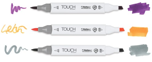
A while ago a good friend of mine introduced me to some Shinhan Touch markers. I liked then so well that I bought a set of their Touch Brush markers. They are rather similiar to Copic markers in that they have abrush-like tip on one end and a chisel tip at the other end.
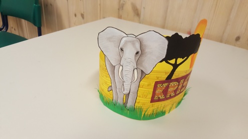
I’ve played a little around with them, but nothing serious. So when a girl at my kindergarten asked for a birthday crown with an elephant on it I decided to give it a serious test.
I started by findin a picture of an elephant to use as a reference. I then lightly sketched the basic shapes with an HB pencil and started filling it out with a light shade of cool gray. I then went over with gradually darker shades of warm gray to build up the values.
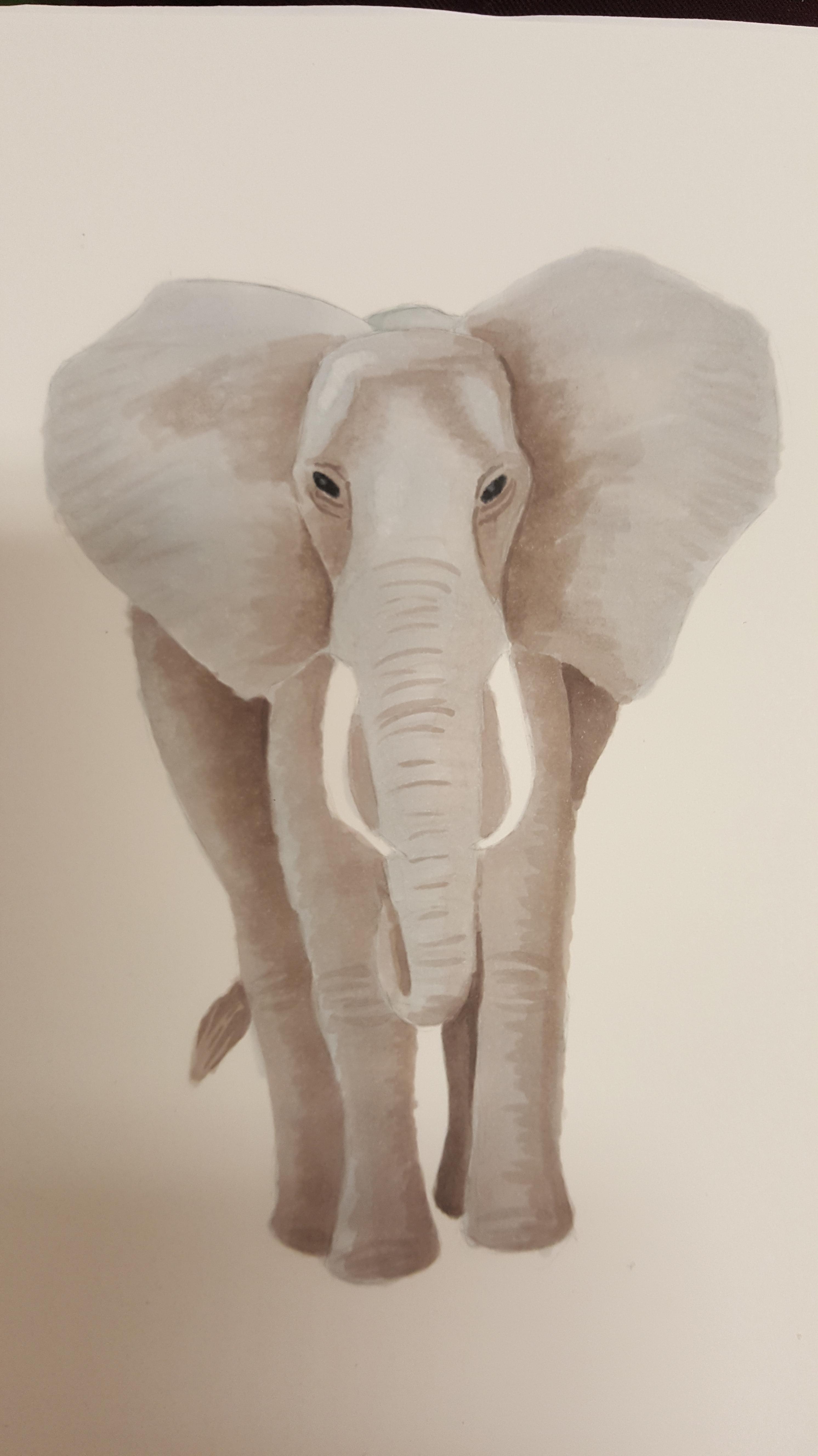
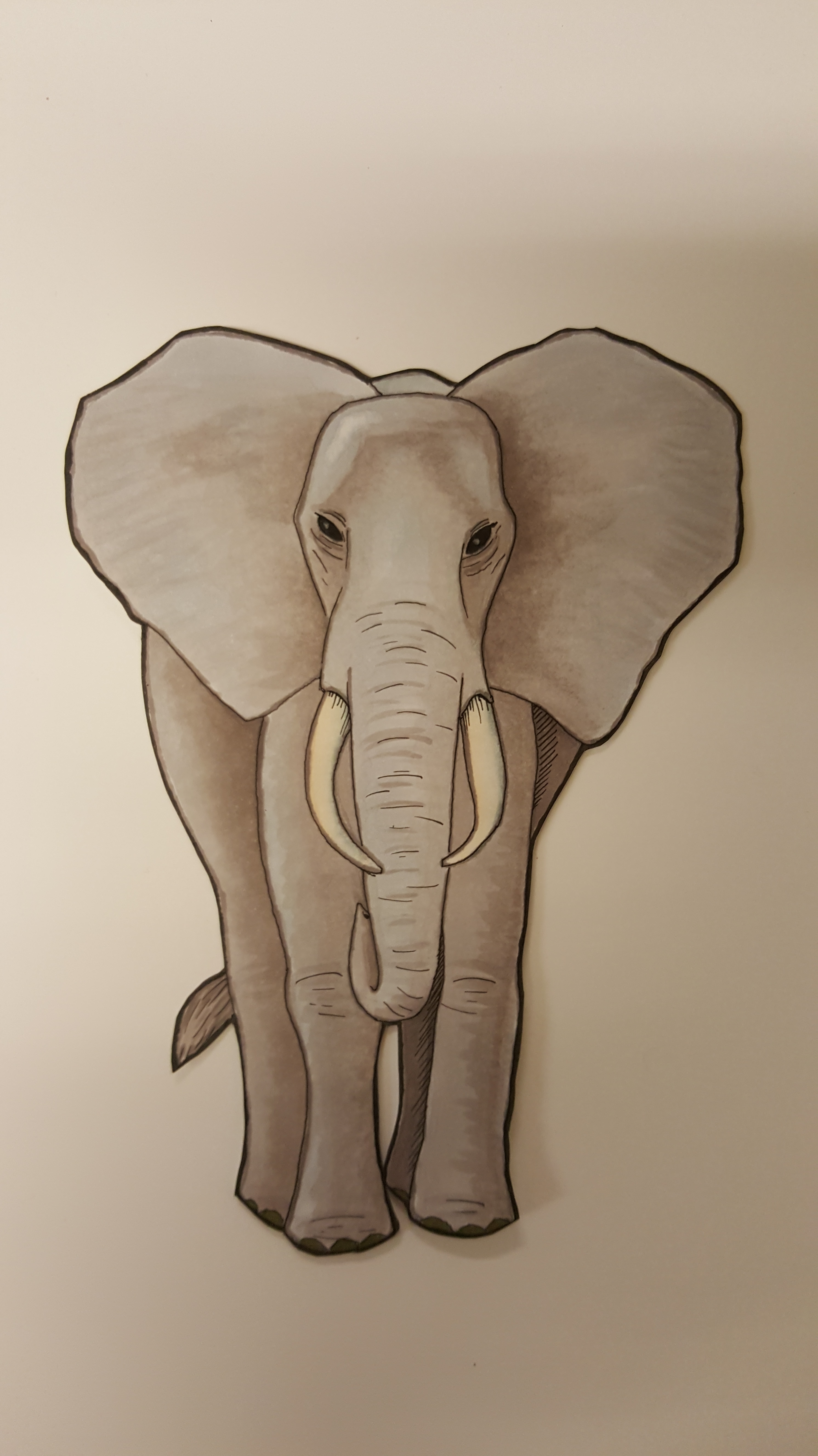
As the image grew darker and got more contrast I started using a very thin fineliner to add some details and create some transitions. I then used a set of sharp scissors to cut it out.
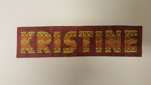
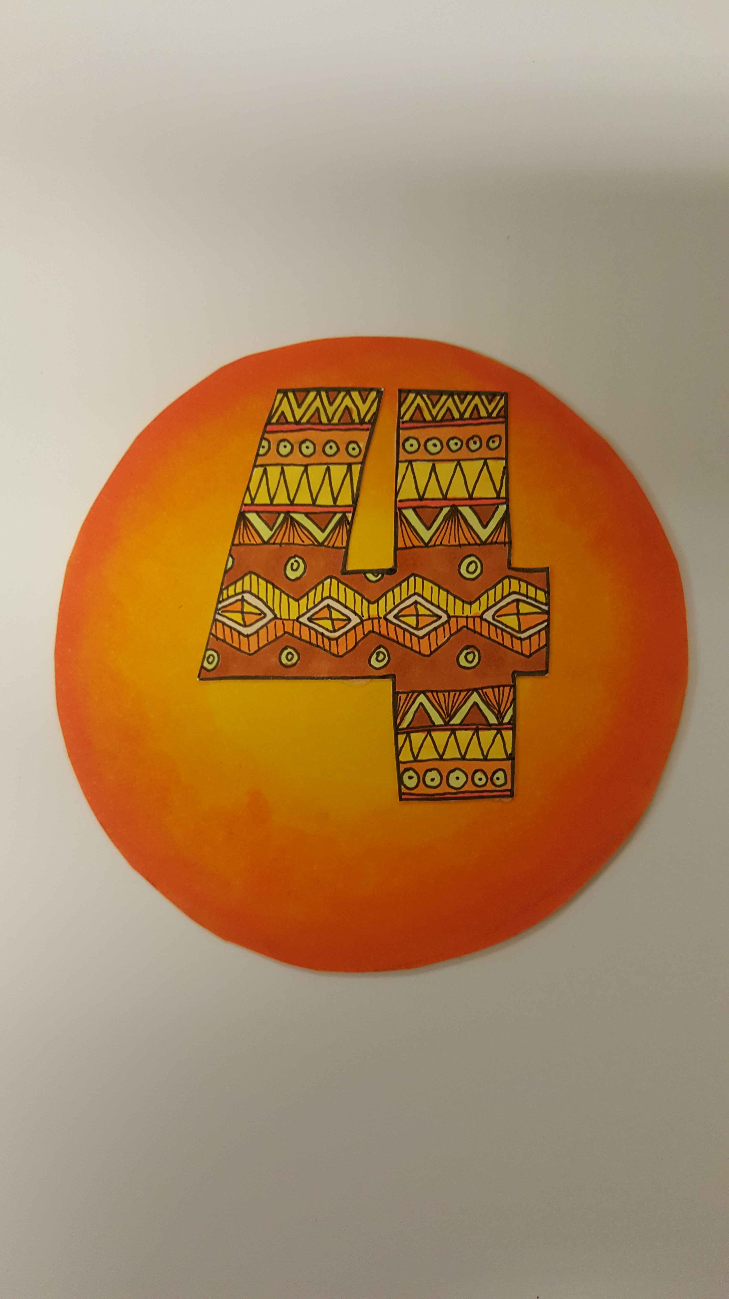
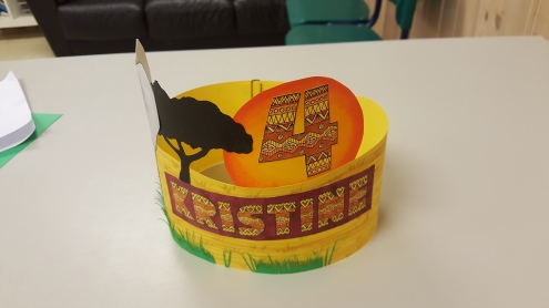
For the name and age I imagined something based on african tribal patterns, and after googling a little I ended up with this:
Using a yellow piece of cardboard uses some light gray, green and yellow markers to draw some grass. I also used some black cardboard and cut out a black tree-shape, and then started gluing it all together into a cohesive whole.
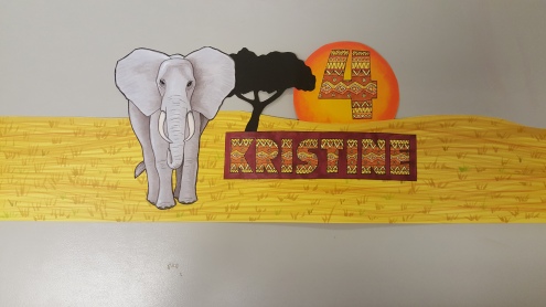
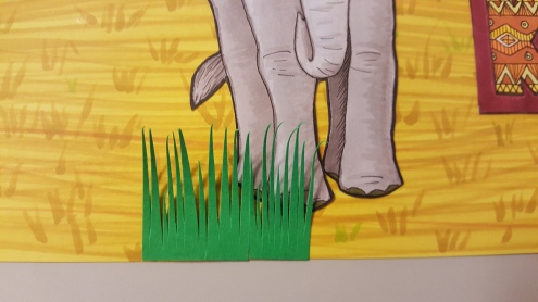
I could have left it there, but remembering an older dino-themed crown I did a few years ago I decided to add a little extra, namely grass. Using green cardboard and a scissor I carefully cut out small tufts of grass that I glued to the bottom.
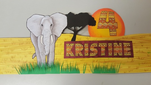
Once done I turned the edges back on themselves and attached to each other.
And here you can see the finished crown in all its elephantine glory.
I love these markers. :)
Tanglewolf
Lately I’ve been obsessed with ZIA, also known as Zentangle Inspired Art.
It’s a strangely meditative way of drawing using repeating patterns. True Zentangles are made on small tiles (3.5 x 3.5 inches wide) and contain only one of about 140 official Zentangle patterns. ZIAs, on the other hand, can be any size you’d like and may also use whatever for of patterns you can think of.
Of if you like the term better, think of Zentangles and ZIAs as doodles. ^_^
Anyway, three days ago I started working on a piece and finished it off the day after, and now I want to show it off and brag about it. That’s right: Brag! I’m really proud of it, and while I can see for myself several areas where I could have done better I still think this is the best damn piece of work I’ve ever done!
 Click on it to see the full details.
The whole thing took me about 6-8 hours spread over the two days, working on it whenever time allowed.
Materials used:
– Daler-Rowney Bristol Board 250 g/m2
– Staetler Pigment Liner 01, 03, 05 and 07
– Pigma Micron 005
– 2H pencil
Original drawing size:
– Paper: 20 x 25 cm
– Image: 18 x 19 cm
Scanned at 300 dpi
So, what have I done with the original?
I’ve given it a black, wooden frame and placed it for sale on Finn.no hoping someone’ll find it decorative enough to purchase it. I’ve also added it to my DeviantArt profile as a print so people can order photos and framed images of it.Why?
With a little extra spending money I might be able to buy more and/or more expensive art supplies so I can experiment more. ^_^
Painting apps and clovers
I’ve been lucky enough to get my hands on a larger tablet and been experimenting a bit with it. I’ve been trying out several drawing apps with varying degrees of satisfaction. Until a few days ago the one I’ve used the most has been Sketchbook Pro, and I’ve gotten fairly familiar with it as well. But, while it is a good program, there’s still things about it that bothers me.
So, I’ve been trying out other apps as well. One is Infinite Painter which is actually pretty good, particularly for painting. The major feature in this app is that you can create your own brushes. Another good one is ArtFlow, who’s has a decent amount of tools and options.
Then there’s all the apps that really scrape to bottom of the barrel. Ranging from the horrible Fresco to the merely middling Watercolors, I’ve quickly stopped using them.
But, six days ago I came across an app that really piqued my interest. The app in question was named Clover Paint, and looked like no other drawing app I’d ever seen. Buttons and sliders everywhere in complete chaos, with a UI that looked about as user friendly as a steering wheel with thumbtacs glued to it.
Still, I gave it a try, and damned if it isn’t the very best drawing program on a tablet that I’ve ever used!

Here you can see the UI in all its bewildering glory (along with one of my not so glorious drawings), sporting dozens of buttons. Here, let’s take a closer look on the interface:

1 – The green and gray buttons along the side are the default tools available. They can be deleted, modified or added to as you see fit.
2 – This is the main drawing area. By default this area is blank, and as soon as you start drawing the canvas is created. As you draw further and further out, the canvas is expanded. There are options for having a fixed canvas instead, but I really love this feature!
3 – The buttons along the top are shortcut buttons that I’ve made and placed myself. These are set to remain visible even with the UI minimized (explained a little later). You can add as many shortcuts as you like, and drag them around to where you want.
4 – Along the right side you control the layers. These panels can be minimized by hitting the small blue icon in the upper right corner. Here you get pretty much all the features you’d expect, along with opacity control, blending modes, merging layers, etc.
By the way, you can export files as PSD files, thus preserving layers.
5 – Color management. Hit the button on the left to access the color wheel, and long-established any of the buttons on the right to store a color there for lat use.
6 – Below the colors you control the pen width, opacity and flow. Fairly standard stuff.
7 – This blue Clover control your navigation window. Just tap it and a small window appear showing your entire picture, as well as there you are zoomed in.
8 – This is the main toolbar. Hold down on any of them for a list of options and tools. You can also tap the View tool to horizontally flip the canvas.
9 – The menu button is used to minimize the UI, allowing you to see more of your drawing at once. Here’s an example:

With the exception of the few buttons I had added manually you have a completely bare drawing area.
So, apart from the highly customizable user interface, what’s to love about Clover Paint?
Quite a lot, actually. As far as I can tell, it’s the single most powerful drawing app on the Google store, and is in fact so complete that I’m thinking more of it as a full fledged drawing program than a simple app.
The first thing you’ll notice is the canvas itself and the way that it expands as your drawing keeps getting bigger and bigger. As per normal for drawing apps you can pinch and stretch two fingers to zoom in and out, but you can also use the same two fingers to rotate the canvas.
Both drawing, zooming and rotating the view is done seamlessly, with no slowdown or shutting.
Another small detail out the UI… There’s an option in the settings that allow you to resize all UI elements to either fit nicely on a smaller tablet or to be larger and more easy to read. Not a huge deal, but a very nice touch.
One huge advantage Clover Paint has over its competitors is the selection tools. Just as in PhotoShop (for the PC or Mac, not mobile) you can select areas of a layer, either though a magic wand or manual selection, allowing you to manipulate parts of a layer without affecting the rest of the image.

And you can add shortcut commands to your devices physical buttons too. My tablet has an ESC button that I’ve set to deselect selections when I press it quickly, and to add a new layer when I hold the button down. You can add similar shortcuts to all your buttons if you so choose, even the power button.
And if you prefer to sketch on your tablet and refine it on your computer you’re in luck. With just a few presses on the screen you can export your drawing as a PSD file, allowing you to import it into PhotoShop with layers and blending modes intact.
But, there’s a few negatives as well, though the don’t truly bother me much.
First is the fact that you can’t create your own brushes, like you can in Infinite Painter. The creator has stated that this is on his to-do-list though.
Far more annoying is a complete lack of instructions or manuals. There’s quite literally hundreds of options to choose from, and you have to actually TRY them out to figure out what they do. A bit intimidating at first, though hardly impossible.
Do i recommend this program? If you’re serious about drawing on tablets, the HELL YEAH!
Stylus in style (or not)
I’ve been drooling over the Adonit JotPro, a stylus for capasitative tablets that allow fine control when drawing over the duge and clunky rubbertipped styli. A few days ago, as I was browsing through YouTube videos, I came across a series of videos by a user named Kobausks where he described how to create a similar stylus at home.
By now I’ve made three of them, and they are quite simply amazing!
If you want to make your own you need the following items:
– A used ballpoint pen or felttip pen
– Some clear sticky tape
– Scissors and/or hobby knife
– A small piece of paper
– antistatic bag (the kind hard-drive are packaged in)
The first thing you need is a simple ballpoint pen. Remove the sylinder containing the ink and the pen tip, and you’ll be left with a hollow tube.

Take a small square of paper and rollout together, really tightly. Then insert it into the empty pen so a small piece of the paper sticks out, just as if it were a pen tip.

Use a small piece of tape and make sure the paper piece is firmly secured to the pen.

If you want to use a used felt tip pen instead you can drop these steps and just use it as is.
Now we need to cut out a piece og the antistatic bag. If you don’t have a bag like that you can use a piece of metallic paper from a bag of chips instead, but then you won’t have a transparent tip on your stylus.
Here’s a simple drawing of what you should cut out. Note the small upside-down L’s on the lower part. You need to carefully cut along them.

Here’s a picture of what the thing should look like when you’ve cut it out. The lower part should be folded as you can see in the following pictures.

Take the pen and align the tip so it matches up with where the packaging material is folded, then use small pieces of tape to attach them together.

One thing to be careful of here:
This material conducts electricity on one side (the outside of the bag), but not the other. Make sure this conductive side is on the outside of your pen as well as pointing downward, or your stylus won’t work at all.
Add another piece of tape to the top of the stylus as well as one on the middle of the shaft. That aught to keep it firmly in place.

I’ve added a piece of tape to the underside of the “tip”, and another on top, to strengthen it.

Now I take a pair of scissors and cut the tip into a circular shape, keeping the tip made of paper firmly in the middle. Take care when you don’t this so you don’t cut off too much. It is better to just trim it slightly and make sure it works properly and then come back and make it look prettier later.

Voila! You’re good to go.
Congrats on making your very own drawing-stylus.
And here’s a short video of me testing one of my styli in Sketchbook PRO for Tablets.
Tablet jealousy & Sketchbook scribblings
I’ve always been envious of people having iPads and being able to use then to create stunning art. Ever since the first ipad hit the market I’ve envisioned using one as a sketchbook, being able to whip it out at a moments notice and start scribbling away, never having to worry about running out of paper or ink.
Now that I HAVE a tablet… Well, I’m still envious of all the ipad owners, but for slightly different reasons. You see, while I can draw quite decently on my Denver tablet, it has a few restrictions that is a little frustrating at times.
The first, and most annoying is that the Google Play store is severely lacking in decent drawing apps compared with Apple’s Appstore. I’m also restricted to a 7″ screen at only 800*444 pixels, along with a slowness processor. This can make the more demanding apps leggy and unresponsive at times.
Griping aside, I now CAN draw, paint and sketch whenever and wherever I want!
So, what have I been doing with it?
I’ve been testing out Autodesk Sketchbook Pro for Tablets. It’s a surprisingly versatile and powerful program, but also takes some getting used to due to all the options available. Here you can see the first drawing I made with it:

Not exactly a Rembrandt or a Monet, but it’s a start.
I don’t know how many of you know of Daniel Jones, but she’s a children’s book’s illustrator, and also have a YouTube account that I stalk follow. She’s been showing off some truly stunning ipad art, and has also written a book about drawing on tablets.
Taking both some advice and inspiration from her, I started to really learn how to draw digitally.
Using a picture reference, I drew a bird. In Norwegian this is called a “kjøttmeis” which translates to “meat-sparrow” or something similar. Imagine my childish surprise when I found out that the English name was “great tit”. *snigger*
Anyways….
First i drew a very rough sketch to block in all the shapes. Sorry for not showing it here, but I accidentally deleted it before saving it to the gallery. On a layer above that I used a pencil to refine the linework. Still rough, but not too messy either.

I then made three new layers below the linework, and set the linework layer to “multiply”, thus making sure it could be seen above all the other layers, while hiding all the white.
The lower level I filled with a greenish, cloudlike gunk. The layer above i painted the wooden branch that the bird was standing on. And the third layer, just below the linework, I filled with a neutral brown color.

Once the bird was filled I locked that layer’s transparency, meaning I could easily paint over it without worrying about painting outside the “lines” as it were. Using a medium size brush set to low opacity I started filling in colors.

It took a few hour, but eventually I felt that adding more detail really wouldn’t improve it any more.
I lowered the opacity of the linework a little and added a layer on top that I filled with a texture set to very low opacity (6 or 8 % i think) just to add a little more randomness to the image.

Here you can see the image I used as a reference:

I’ve also started on a new image, one of our rat named Lara having a nap.
She looks so cute and defenceless like this. :)
Here you can see the photo reference and the initial sketch (with some linework on top) :


Unlike the bird that I drew using a stylus, I worked mostly with my fingers on this one.

Once done I created a layer for the background and filled it with a neutral color. I then made a new layer for the rat. I painted over her with a fat brush, fast and dirty, making sure every part of her was covered. I then went along the edge with an eraser and removed everything that had gotten outside the linework.

And that’s as far as I’ve gotten with this drawing. I’ll show you more later. So long…
