Elephantastic markers
Hello again, and sorry for the long hiatus. It’s been nearly two and a half years since I last updated this blog. Sorry to the few loyal followers I have/had, but life happened and things escalated and the blog ended up in the big space waaaay back in my brain where lost thoughts so to die.
Then, yesterday I suddenly thought of it again, even if indirectly. You see, at my kindergarten we have have a few students working with us at the time, and during a conversation about projects we’ve done with kids I remembered my train-montage and went online looking for it… Ending here.
Last night I ended up thinking a lot about the blog and decided to give it another go. I don’t know how often I’ll post or how regularly, but I’ll give it a whirl.
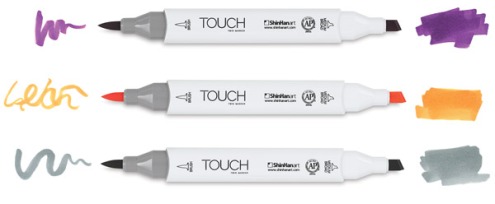
A while ago a good friend of mine introduced me to some Shinhan Touch markers. I liked then so well that I bought a set of their Touch Brush markers. They are rather similiar to Copic markers in that they have abrush-like tip on one end and a chisel tip at the other end.
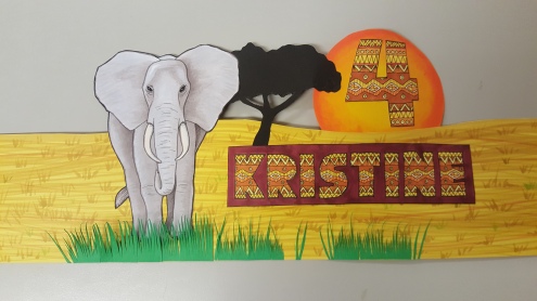
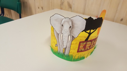
I’ve played a little around with them, but nothing serious. So when a girl at my kindergarten asked for a birthday crown with an elephant on it I decided to give it a serious test.
I started by findin a picture of an elephant to use as a reference. I then lightly sketched the basic shapes with an HB pencil and started filling it out with a light shade of cool gray. I then went over with gradually darker shades of warm gray to build up the values.
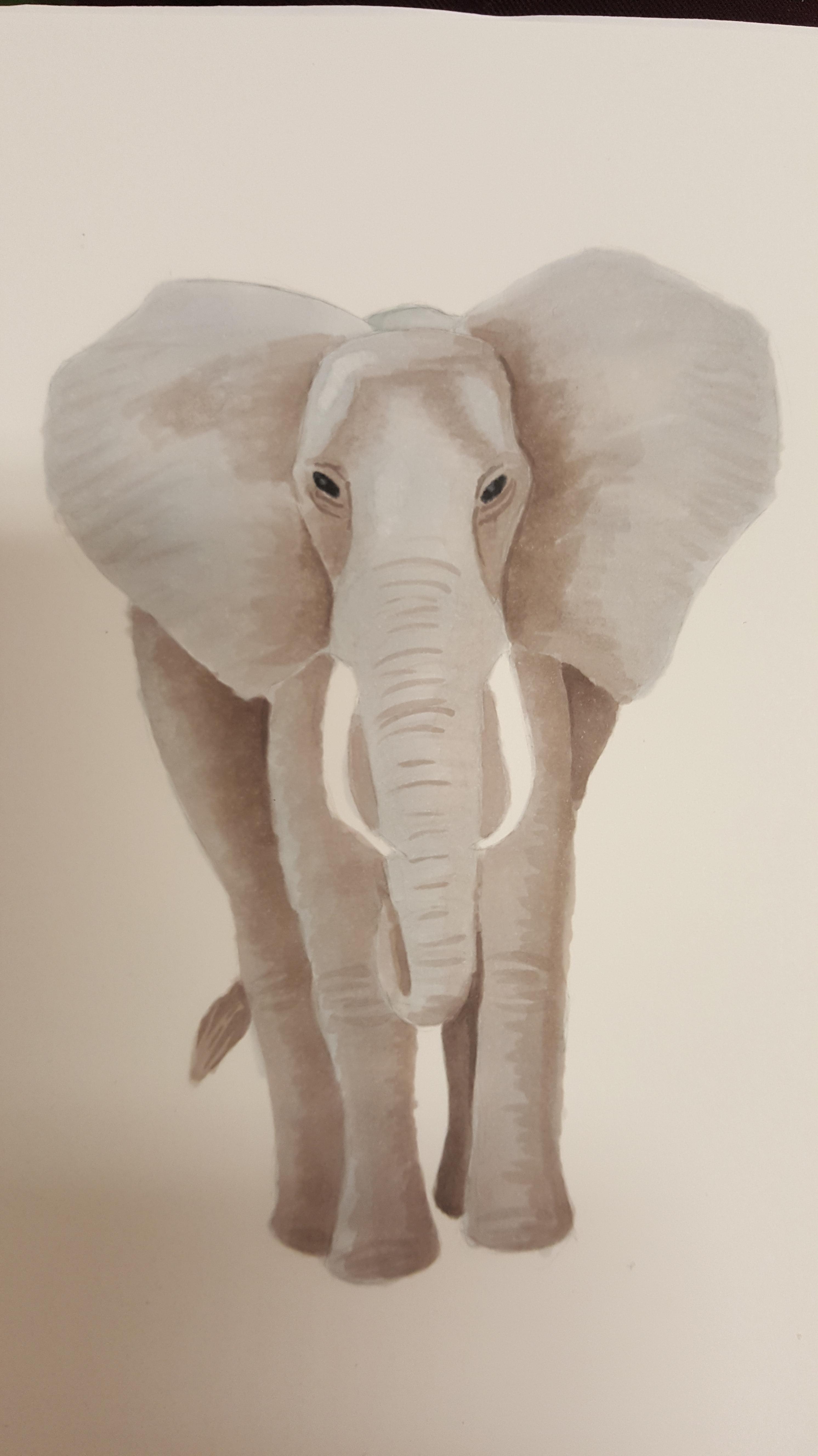
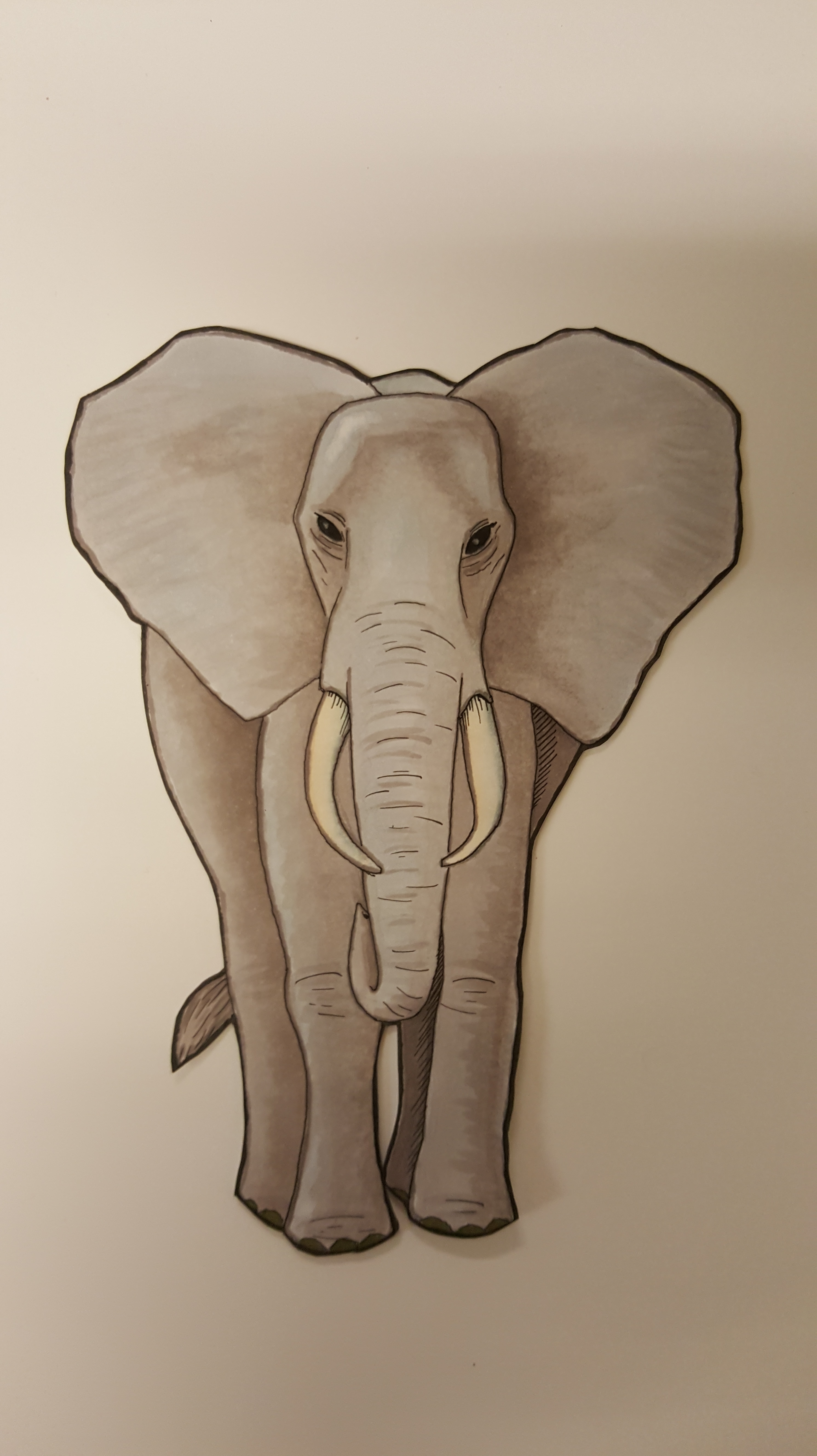
As the image grew darker and got more contrast I started using a very thin fineliner to add some details and create some transitions. I then used a set of sharp scissors to cut it out.
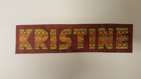
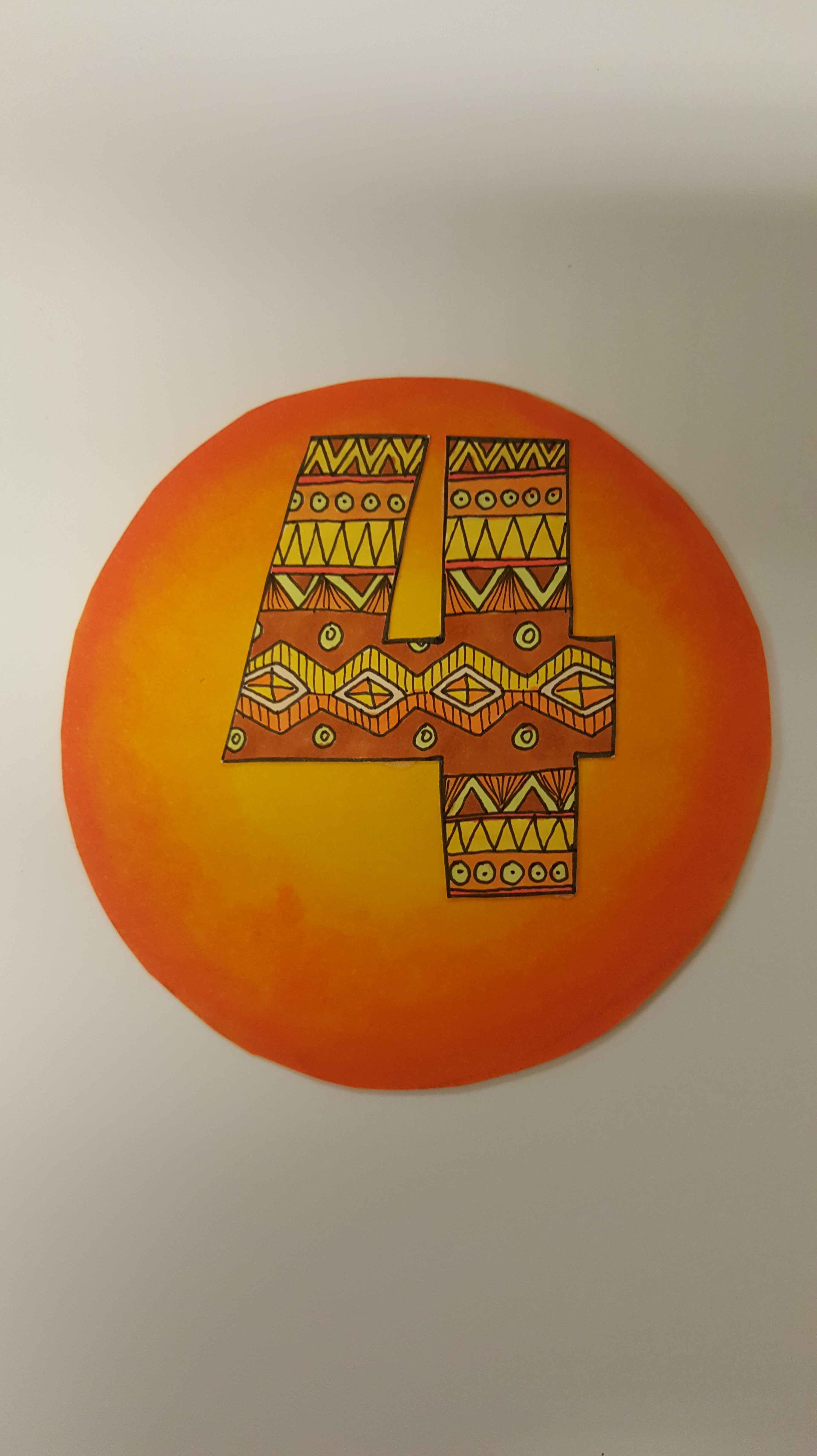
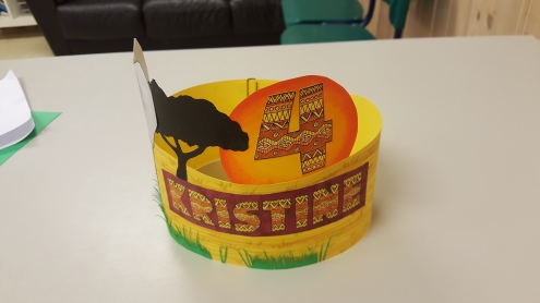
For the name and age I imagined something based on african tribal patterns, and after googling a little I ended up with this:
Using a yellow piece of cardboard uses some light gray, green and yellow markers to draw some grass. I also used some black cardboard and cut out a black tree-shape, and then started gluing it all together into a cohesive whole.
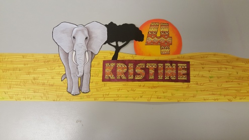
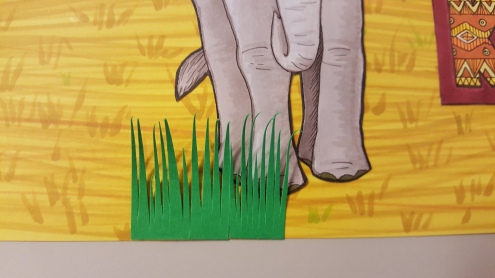
I could have left it there, but remembering an older dino-themed crown I did a few years ago I decided to add a little extra, namely grass. Using green cardboard and a scissor I carefully cut out small tufts of grass that I glued to the bottom.
Once done I turned the edges back on themselves and attached to each other.
And here you can see the finished crown in all its elephantine glory.
I love these markers. :)
Bloodsuckers!

I’ve been working on this comic ever since the last topic, the one about using Promarkers. There’s several reasons why I wanted to make this comic, actually.
- I wanted to see how a complete page looked when shaded using markers.
- I wanted to experiment more with using values instead of colors to define shapes.
- I wanted to challenge myself to draw from multiple angles.
I’m certain you’ve seen plenty of example of how NOT to do that last one. Heck, I’ve been guilty of that crime myself, more than once. Here’s an example (one of my old strips, from before I started this blog):

Looks familiar, yes? Just two persons standing next to each other with just minimal changes to facial expression and only the text to really bring the plot home. THAT’S what I’m trying to avoid here, by letting the pictures speak as much as the words do.
Please let me know if I failed, and if so, how I can remedy that for the next one!
Anyways, back to the comic at hand.
I started, as I usually do, by sketching, doodling and scribbling on some office papers. You know, just to get the creative juices flowing, and to prepare for the real deal. Here’s the two sheets I maimed in preparation for this praticular comic.


As you can see I started with some light scribblings on the left skeet, trying out the “anatomy” and characteristic of the main character. I then created the thumbnail you see on the right sheet. Observe how I changed some panels completely from the initial idea. I also wrote down the text and refined it a bit, as you see from the difference between the two sheets.
After sketching was done I went through the regular routine: Drawing in the pencils, and then inking. I had a hell of the time penciling the fourth panel, though. No matter what I did I couldn’t get the arms right, and had to change them a bit from my initial idea (right sheet above), particularly the swordarm.
Once the inking was done I scanned it in, and here you can see the thing before it was shaded with markers.

The marking itself was really easy and fun to do. I think I spent about the same amount of time shading that I usually spend on digitally coloring, so it’s no time-saver by any strech of the word, but it was immensely satisfying to see a new technique and method work so well on my first attempt.
I’ve noticed in hindsight that the text and wordballoons are a bit on the large side, but were really uncertain about how large they should be when I drew them. I guess that’s an art that comes with practice.
And speaking of text, I lined up guidelines with a ruler to get the letters as uniform as possible, but that turned out to be a really bothersome and inaccurate method. I aught to get myself an Ame’s Lettering Guide to correct that mistake.

Oh, and remember: Click the images to see them in all their fullsize glory and detail. ;)
